
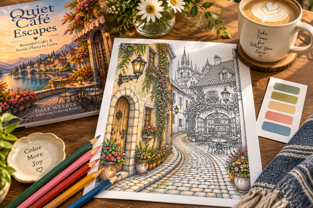
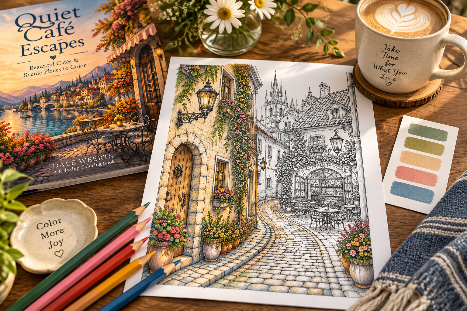
Have you ever opened a coloring book, looked at a beautiful illustration, and wondered where to begin?
Sometimes the hardest part isn’t coloring.
It’s choosing the colors.
With dozens of pencils or markers available, the possibilities can feel overwhelming. But creating a pleasing color palette doesn’t require artistic training.
A few simple choices can make the process much easier.
Start With the Feeling You Want
Before choosing individual colors, think about the mood of the scene.
Do you want it to feel warm and welcoming? Peaceful and quiet? Bright and cheerful?
A cozy café might inspire warm browns, soft creams, muted greens, and a touch of terracotta.
A seaside setting might suggest blues, sandy neutrals, and gentle greens.
There is no single correct palette. The goal is to choose colors that create the atmosphere you want.
Begin With Just Five Colors
You don’t need to use every pencil in the box.
Try selecting five colors that work well together.
For a warm café scene, you might choose:
- Cream for walls and lighter surfaces
- Warm brown for wood and furniture
- Sage green for plants and accents
- Terracotta for pottery or upholstery
- Golden yellow for sunlight and small details
You can create lighter and darker variations of those colors as you work.
A limited palette can help the finished illustration feel connected.
Look for Inspiration Around You
Color combinations are everywhere.
Look at photographs of places you love, flowers in your garden, a favorite room, or the colors of a sunset.
You might even find inspiration in a coffee mug or a patterned pillow.
If you like how the colors work together in real life, try bringing them into your coloring page.
Test Your Colors First
Before committing to a large area, try your colors on a separate piece of paper.
Place them beside one another.
Do they create the mood you imagined? Is one color too strong? Would a softer shade work better?
A quick color test can save frustration later.
Let the Page Become Your Own
The wonderful thing about coloring is that you don’t have to reproduce the scene exactly as it might appear in real life.
A café can have blue chairs instead of brown ones.
Flowers can be purple, orange, or any color you enjoy.
You can create a sunny afternoon, a cozy autumn morning, or an entirely imaginary place.
The illustration provides the starting point.
You decide what it becomes.
If you’re looking for a place to experiment, Quiet Café Escapes: Beautiful Cafes & Scenic Places to Color offers a collection of café and scenic illustrations waiting for your own color choices.
Choose a few pencils, find a comfortable place, and enjoy the process.
You don’t have to know exactly how the finished page will look before you begin.


Leave a comment